When a potential customer checks out your TpT product, one of the first things they are going to do is hover over the preview images. These images will play a large role in their purchasing decision.
We all want to see what we’re getting before we buy, and your preview images are where you get to do this for your customers. Great preview images will dramatically increase your conversion rates.
You only Get 3 Preview Image Thumbnails
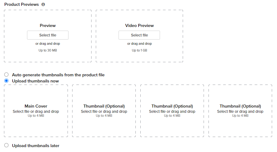
After your cover image, you get three thumbnail preview images. So you’ve got to make the most of them. This is one of the most crucial items that will convert viewers into paying customers.
So how do we maximize these three images?
What do Customers Want to Know
When a customer is looking at a TpT product, they have a few questions in mind:
- What is it?
- What’s included?
- How does it work?
- How will help my students?
- How will it help me?
Your goal is to answer these questions (or most of them) with your preview images.
Why you Shouldn’t Just post an Image of the Product with the Word PREVIEW Over It
Something we talk a lot about in my copywriting course is that you can’t assume the customer will understand the value of the product. You have to explain it to them clearly. Come out and tell them why something is so great.
Check out this image of a 15 pack of Dr. Pepper being sold by Walmart. What do you notice about what they don’t trust you to figure out on your own, so they come out and tell you? (answer below the image)
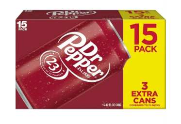
In the bottom right it says, “3 extra cans.”
It’s not that they don’t think you can do simple subtraction. It’s that they are coming out and telling you the benefit, that you’re getting three more cans than you normally do. They want to make sure that you don’t miss the benefit, so they emphasize it.
I want you to keep in mind as we make our preview images. Don’t assume the customer will understand the value of your product (or how it works, or the answer to any of those questions above) by seeing the image. Tell them the value.
This is why you shouldn’t merely post an image of your product with some lines through it. This leaves too much up for chance. You need to come out and tell them why you’re product is so great.
Use Words in your Preview Images
How do we tell our customers why our product is great, or how to use it, or what’s included?
We have to use words.
So on your preview image post images of the product with words that explain why it’s so great, how it works, what the benefits are, etc.
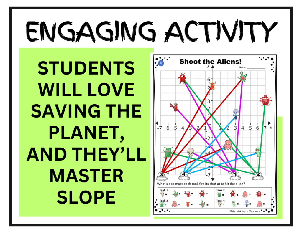
Remember that your words are going to be on a low-quality, small image. So you have to say a lot in as few words as possible. Make them big and well spaced out. Use a font that’s easy to read.
Make it Pretty
Just like we want our cover images to pop and have pizzazz. We want our preview images to look really nice as well. Our customers need to believe that they’re getting a high-quality product that you spent lots of time making just for them. They must know, from the images, that this product is going to look and work beautifully.
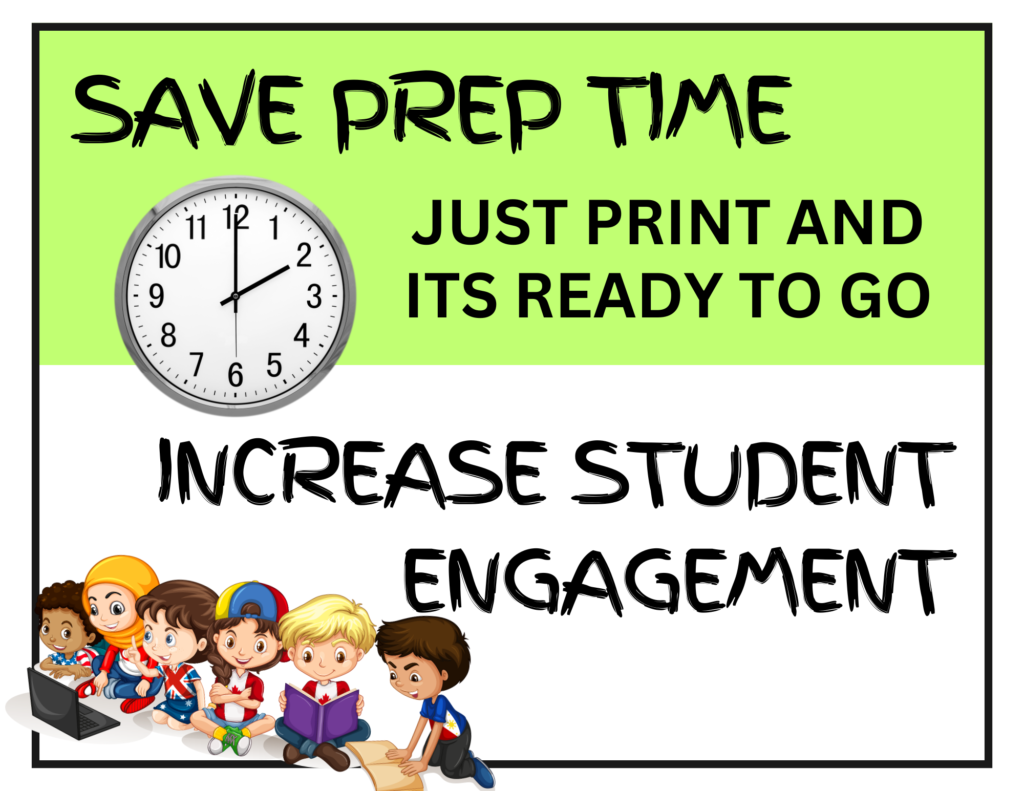
So in your preview images use colors. Use legible fonts. Use images, clipart, or embellishments to make it more appealing.
And don’t clutter it up! Too much doesn’t look good. It’s also overwhelming.
Include Images of the Product
Customers want to know what they’re getting. So don’t keep it a secret. Make it obvious, so they know what the resource looks like and how amazing it is.
Sometimes, we’re afraid to do this because we’re worried someone will steal our work. Which is a legitimate concern. So think, creatively, about how you can still show off your product, without someone stealing your work.
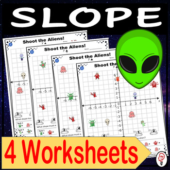
The above image shows what the individual worksheet looks like and highlights that there are four of them. They overlap each other so that no one can steal the images, but it gives you a good idea of what they look like and how they’re different. (As an aside, this is an image I should flatten using flatpack or a similar tool).
What Size Should TpT Preview Images Be?
They should be square, just like the cover image.
Highlight your Main Features
Good copywriting helps the reader understand the value of the product and moves them towards a purchasing decision. Your words and images need to convey why your resource is the best.
You should do this by highlighting the pain the customer is feeling, and showing them how this resource will solve that problem for them.
Another great strategy is to showcase what makes your product unique. Highlight the features of the product.
Talk about the wins. What will the teacher or the student get when they purchase? Will they be better at writing? Will they have fun? Will they finally be able to visualize something or practice something in a certain way? Explain the benefits.
What should be on your Images?
Each image should have an image of your resource, or of multiple worksheets, or a section of it. You should have a little text on the side, top, bottom (or even in the middle) that explains a key feature or benefit of the resource.
One image should be a ‘what’s included’ page that shows everything that’s included in the download.
Remember to show and to tell. Show the resource, and what’s great about it, and then tell the viewer what they’re looking at.
Make it Different from your Preview Download File
Your TpT product upload screen also has a spot for a downloadable preview file. These two things should not be the same.
Do not make your preview file, and then use some (or all) of the images as your preview thumbnail images.
The reason is that it’s redundant. And it makes you look bad.
Also, the orientation should be different between the two.
So do something different on your preview images than your preview download file. Yes, it takes more time, but it will make you more money. And if you get in the habit of using templates, you’ll be able to do it quicker than you might think you could.
Use a Template
A great time saver is to build a template that you work off of. Besides saving time, this will keep your branding consistent. It will also help you stay focussed on what you should be including on each slide.
I have a TpT Preview Image Template that you can use if you would like to have great looking preview files already made for you. These beautiful designs will keep you on track, reminding you of different ways to format the images and get good ideas of what to include. They come pre-formatted with embellishments and great layouts. And they are fully customizable. Change the colors, images, words, etc. to make it match your brand.
These 15 image templates will save you time, plus guarantee that you’ve got amazing preview images that do their job: to make your products look amazing and increase your conversion rates. They come as a Canva template link.


Alright lads, heard about m8888e and decided to give it a go. Pretty similar to other sites, but what I like is the bonus they offered when I joined. Check it out if you’re looking for some decent promos!