Your cover image is the first (and sometimes only) image of your product that potential customers will see. So you need to make it a good one so that they will click on your product to learn more about it.
No one will read your product description or look at your preview images unless persuaded to do so by your title and your cover image.
Here are a few tips to help you find success.
What Size Should My Teachers Pay Teacher Cover Image Be?
The size of your cover image should be at least 750 pixels and no larger than 2 MB (according to TpT).

What Proportions or Aspect Ratio Should My Teachers Pay Teacher Cover Image Be?
Your proportions should be square.
Some websites will give you slightly different dimensions, and you can follow them if you like, but square works really well.
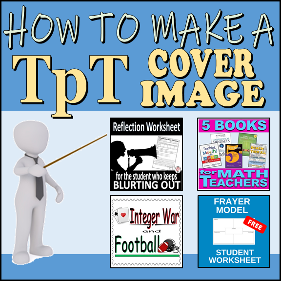
How to Design Your Cover Image
I encourage you to go to TpT and do a quick scan of resources. As you do, look at a few things about some of the high ranking posts that you see. Also see which ones catch your eye, and ask yourself what about them is captivating.
Here are a few things to look at as you scan other cover images, which we will be discussing below: Title, footer, image, colors, and font.
Title
Also called the Text Header
The main feature of most cover images is the header text. It’s usually just a few words describing the product that are behind a plain colored background at the top or bottom of the image.
This is usually about 1/3 or 1/4 the size of the image and is what your eye is first drawn to.
So keep it plain, easy to read, with colors that make it pop.
Usually, the title image is inside a colored box to make it pop out. In the one below, it is in a white space, but the next cover image I will show you will have the title in a contrasting color box.
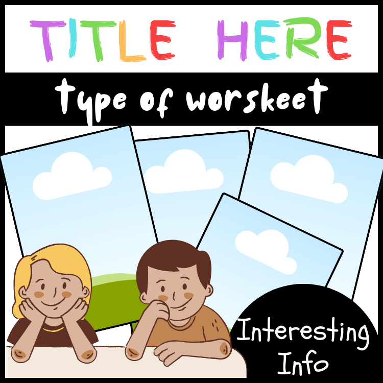
Look at the template above (by the way, you can get this and 16 other templates, I’ll tell you more about that later). Notice the title. It’s big, easy to read letters (which are all capitalized by the way). The title is centered, as most are. But unlike many titles, it is not monochromatic, it uses many colors.

Images
Between 1/2 and 3/4 of the cover image is a photo or clip art (or a combination of both). The image is usually a preview of the product or it’s an image that is related to what the product is about.
The image is usually separated from the words with different colored backgrounds and often a line.
It’s okay to put the image over words, as long as the words are easy to read, or to put a clipart image over the image of the product (like in the cover image below).
Most good cover images have an image of the worksheet (or multiple images). It needs to be large and clearly convey how great the worksheet is and looks. If you use a clipart, it should add to the theme of the worksheet. So if you have a Martin Luther King, Jr. worksheet, an image or clipart of him would be great. If you have a science worksheet on frogs, a clipart of a frog would be ideal.
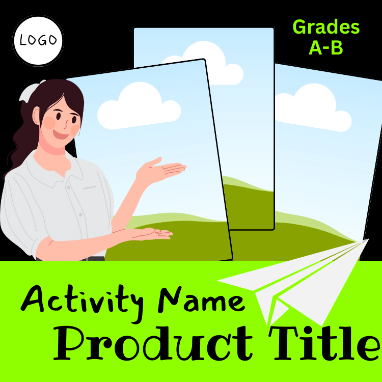
Notice the image above has three images where you would put the worksheet image. The clipart is not related to the product, it’s just of a person pointing at the image. Also note that in this cover, the title is at the bottom, and it is in a contrasting color box. The font colors match the background of the cover image.
Footer
Many images use the footer section to provide more information about the product. Don’t put too many words, as it’ll be hard to read.
The footer text should again be separated from the majority of the image with a plain colored background, usually different from the rest of the image.
Footer texts are smaller in size than the header, and normally a different font. Often they are also a different color.
Another good idea is to use a shape (like a banner or star) and offset it (not centered) to convey extra information that you might do in a footer.
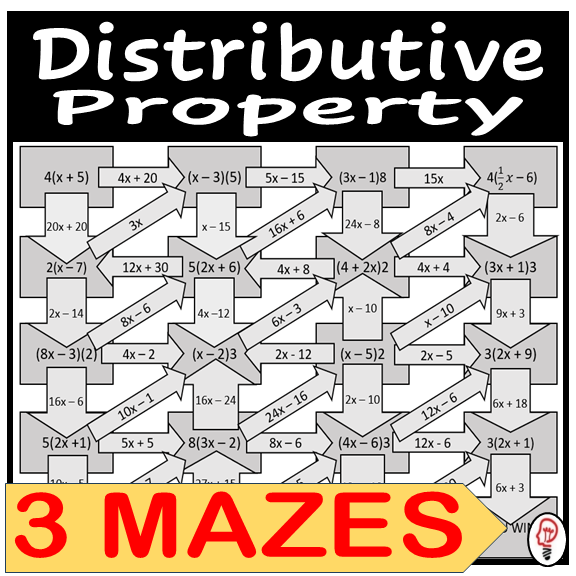
Look at my TpT cover image above. Notice the footer is a banner image. It tells you what type of worksheet / activity the product is as well as how many of them there are. This is a good example of a good footer. Also, note that it is not centered.
My error might be that it is a contrasting color and its text is larger than the header, so it draws the reader’s eye to it first.

The Main Goal
Remember that the goal of your cover image is to get the teacher’s attention and peak their curiosity.
Your product description is what will make the sale, the image is to get them to the product description. So make it appealing.
Premade TpT Cover Templates
Premade cover templates are a great way to save time and guarantee that you’ve got an eye catching cover image. So don’t feel bad if you spend some money to save your time and get you more clicks.
There are lots of places to get premade Teachers Pay Teachers Cover Templates, and they all work the same. They come predesigned, so you don’t have to worry about formatting or selecting embellishments or font styles. You just change the colors to match your brand, change the words to fit your product, and then upload your worksheet images and logo. (You might also want to change the clipart if it has that).
An easy place to find cover templates is on Teachers Pay Teachers. Just type in “Cover Templates” into the search bar. Just pay attention to the type of file they are (which it should say in the product description). Most are either a Microsoft PowerPoint, Google Slides, or a Canva template. make sure you have that program (Canva is a website and is free to use) and are familiar with it so that you’re not stuck trying to download something or learn a program after you’ve made a purchase that’s supposed to save you time and make your life easier.
I have made 17 TpT Cover Templates, and they’re pretty good if I do say so myself. Feel free to check them out if you’re interested in purchasing premade templates. My templates are in Canva.

Free Checklist on TpT Optimization


What Next?
- Creating Great Product Descriptions
- Making Thumbnail Images
- How to Make an Amazing Preview File
- Cover Images
- How to Get More Sales with Custom Categories
- The Value in a Thank You Page
Other Resources
- Getting Started on TpT
- Email Marketing
- Blogging
- Copywriting
- Grow your Facebook Audience
- Join the Membership
