Your preview images and downloadable file will play a huge part in your conversion rates. TpT has come out many times and said that over half of customers on the site won’t make a purchase if there’s no preview image or file. But I want you to understand that your previews will be the difference between your selling a little and selling a lot.
Beautiful, well-done preview images and files will make your product irresistible. And mediocre ones that don’t answer the buyer’s questions will send them searching for other products.
For information on what to put in your TpT preview images, click here. For information on what to put in your preview download, keep reading.
What’s the Difference between the Preview Images and the Preview Download?
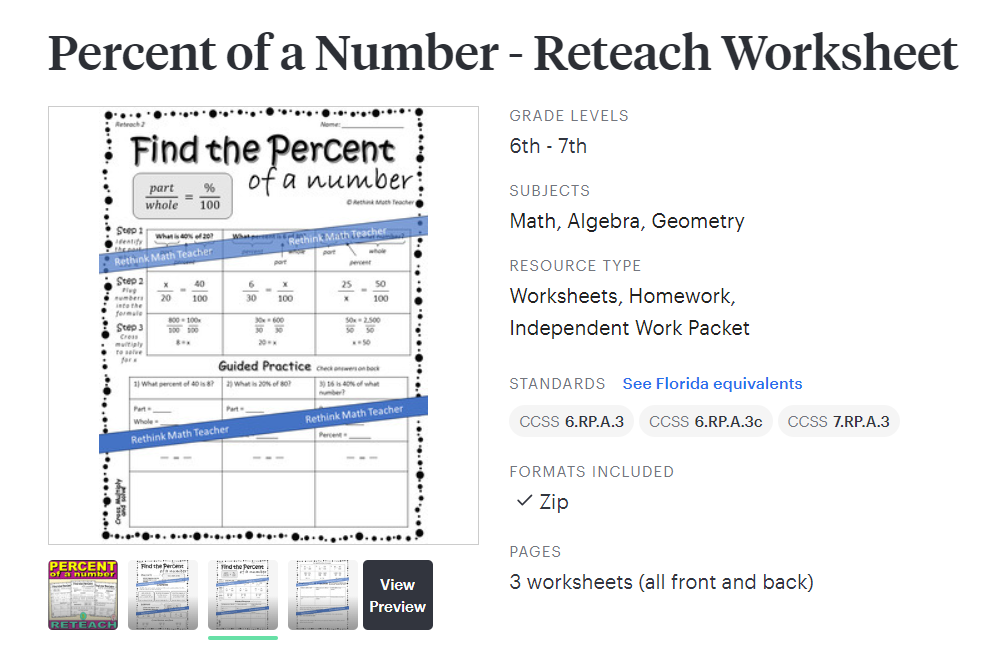
When you click on a product on Teachers Pay Teachers, you will see 4 images and a view preview box.

The first image is the cover image, which also appears on the search screen or when you post your product on social media. The next three images are preview images that you make to show off your product. (Again, you can read more about preview images here.) The next box that says “View Preview” is the preview file.
This is the file that we are talking about in this post, and it is a valuable asset to helping you make more money.
How to Make the Preview File
A great strategy for making your preview file is to do so in PowerPoint, Canva, or Google Slides. Then save it as a PDF.
Many TpT sellers will use Flatpack or Adobe Pro to flatten their preview files. This helps prevent someone from stealing their work.
The preview file should be several pages (images) and have a combination of well written words and beautiful images that convince the customer that your product is perfect for them.
What Image Size should you use for your TpT Preview File?
For the preview file, it’s a good idea to have landscape images. I like using 11 x 8.5 or 16:9.
This works nicely because it fills up the entire computer or phone screen.

How Many Pages Should Your TpT Preview File Be?
Teachers Pay Teachers recommends between 1 and 3 pages. I say 3-5. But TpT probably knows more about what works on their site than me.
You want your preview file to be long enough to include the key elements I list below, as well as to do an excellent job of showing off your product and convincing the buyer, without being so long that it’s confusing or makes the product seem confusing.
A long preview file, just like a long product description, makes your product seem too involved or complicated. Remember, teachers are buying your resources to save time and energy. They don’t want complicated, involved, or difficult. So your file length can’t be long!
What Should Your TpT Preview Images Look Like?
Much like your preview images, you want your preview file pages to look professional. They should be aesthetically pleasing to the eye and include pictures of your products and a few words. The preview file will be bigger than the images, so it can have more words than the preview images do.
You also want colored accents in the background with eye-popping embellishments that show off your beautiful products.
Make sure every page includes an image or images of your product. It’s okay if it’s not the whole page. You can show just a section, or show multiple pages (or sections) on top of one another. But you want the customer to know exactly what the product is.

What Your Preview Image Should Not Look Like?
Do not put the whole image of your product in the preview file. Since it’s downloadable, this will give anyone access to it without paying you for your hard work. You do want the reader to be able to see what the product looks like, but you do not want them to be able to take a screenshot (or download the PDF) and be able to print it. So either protect yourself by covering up parts of the image, putting a watermark or the word “preview” over it, or doing something else so the viewer doesn’t have access to your entire resource.
Your preview file (and images) should also not simply be your image with the word “preview” over it. You need to tell the reader why your product is great. Explain the benefits. Don’t assume the customer will understand what’s so great about it just by looking at it, come out and tell them (more on that below).
Finally, your preview file should not be the same as your preview images. If it is, there’s no point in having the preview file.

What your TpT Preview File Should Include
Your preview file should have a few pages (somewhere between 1 and 5). Each with an image, or images, of your product and words that explain why it’s so great or what it is / does.
Each page should do one of the following
- Explain what it is
- Show everything that’s included
- Show how to use (it’s advantages)
- Explain what makes it great (benefits)
- Highlight key features
Don’t try to do too much on a page. Stick to accomplishing one of the tasks.
Another page that TpT sellers love to include is a reviews page, where you take screenshots of the reviews (whether it be from TpT or comments on social media) and put a few of them on one page. Social proof is a powerful sales tool, so this is a great strategy. But obviously, it’s one you can only use after you’ve had a few reviews of the product.

Be sure to include images of the product.
Overcome Objections
Another great sales strategy is to think of your customer’s objections. Why would they NOT by your product? What concerns do they have? Think of all of those objections, and then overcome them on your sales page. You can do this in your product description or in your preview file (or both).
Want help making Beautiful Preview Images Quickly and Easily?
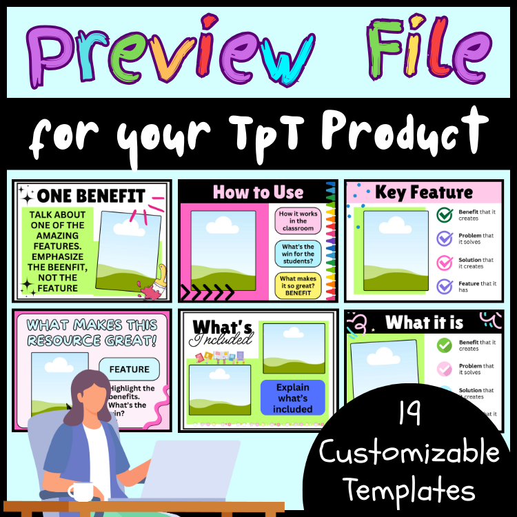
Doing everything we’ve mentioned in this can be time consuming. Plus there is an art to making them look good (we’ve talked about the science in this post). That’s why I’ve created a premade template with at least 19 different images for you to customize and make your own phenomenal preview file in minutes.
This template is a Canva Template link. After opening it, you make a copy in your Canva account and then quickly customize it with your colors, images, and words, to have the perfect product file.

Why Choose My Canva Template?
Enhanced Visibility: Stand out from the crowd and capture the attention of potential buyers with eye-catching product previews that showcase the value of your resources.
Increased Sales: By presenting your products in a professional and appealing manner, you’ll see a significant boost in conversions and sales.
Time Efficiency: Save valuable time and energy by utilizing this ready-to-use template, freeing you up to focus on creating exceptional educational resources.
Large Variety: This template comes with 19 different images for you to customize and make your own. Has many different formats and styles so that you can pick the ones that are perfect for you.
How to Use:
- Open the Canva file provided in the link.
- Customize the colors, text, and images to align with your brand and product offerings.
- Upload images of your products to showcase their features and benefits effectively.
- Save and download your personalized product preview, ready to upload to Teachers Pay Teachers and attract more buyers!
Unlock the power of professional product previews with my Canva Template – the ultimate tool for teacher entrepreneurs looking to maximize their impact and sales potential!

MCW7733 is cool. Easy to navigate and loads of games. Could improve on the bonuses, but overall a solid site. mcw7733