
When teachers go onto TpT to order a product, they generally type something in the search bad and then scan a long list of results. Or, they do a search on Google or Pinterest and are again shown results from TpT that match their criteria.
If you’ve ever had this experience, you will note that there are no shortage of resources now available on whatever you are searching for. So how do we get our product to stand out amongst the crowd?
One way is to make your product visually appealing.
It’s true, we do judge books by their cover. And when judging TpT products against others, we will look at the previews and read the descriptions (as well as consider the price) in order to make our selection.
So how do we make our product look visually appealing so that customers are more likely to purchase ours over someone else’s?
1 – Use PowerPoint
If you are creating products for TpT, you will want to use PPT to make them. The reason is that it’s much easier to move texts and images around in PPT as opposed to Word.
In Word, moving fonts or images affects the formatting of everything. So it takes a long time to get things to look the way you want them to. In PowerPoint, however, everything can move independently of the other item. Making formatting quick and easy!
Plus, PPT also has layering and basic text and image editing.
Adding borders in PPT is also very simple, whereas doing so in Word is a nightmare!
If you are not using PPT to create your products, you need to. Make the switch now. And if you are just beginning on your TpT journey, I’m glad you are reading this as you begin. Start with PPT. You’ll save yourself a lot of time and headaches.
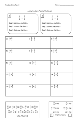
The worksheet above was made using PPT and would have been very difficult to create in Word. Notice some of the elements. A worksheet label in the top left and a spot for the name in the top right. Boxes below the title with equations and boxes inside of them. Answer keys on the bottom that are upside down.
Nothing super complicated, and yes, it could be done in Word. But it’s SO MUCH EASIER in PPT – and quicker.
2 – Borders
Everything looks better with borders.
Borders make your product pop, and the images stand out.
Add borders to EVERYTHING that you make. Just start doing this now.
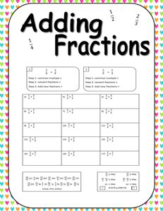
Look at the image above, of the worksheet I made in PPT. Not that appealing, is it? Part of the reason is it doesn’t stand out from the rest of the page, because it has no border!
When I began my TpT journey, I was always rushing to upload products, so I didn’t put borders on most of my stuff (the image above is a prime example). I now find myself spending a lot of time going back into my old products and updating them with borders (and a few other things that I go over in my online course for teachers starting on TpT).
You can use the box tool in PPT to create a simple border. You can use the rounded rectangle tool to give a little bit of contrast. You can also change the line weight (thickness) and type of line (dashed, broken, etc.) to give yourself more options.
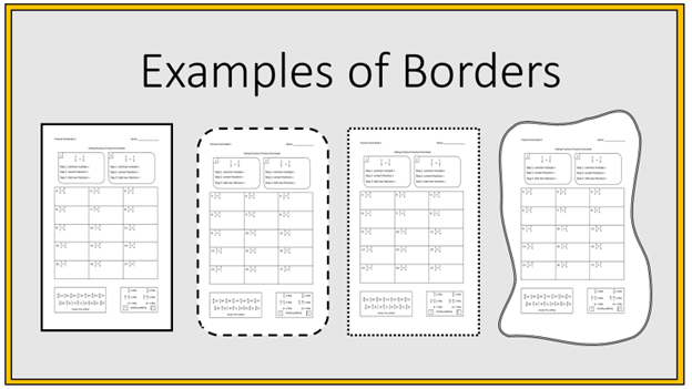
In the image above, I have made several different types of borders using the shapes tool in PPT and put them on that bland worksheet I used as my first example above. Notice that just adding a border helps.
The first image is a regular box with a thick outline. The second is the same as the first, but I changed the shape to have rounded edges and made the lines dashed. The third is also the same as the first, but with a dotted outline instead of a solid line.
The final one is also the same as the first, but a bit more tricky to produce. I used the ‘edit points’ feature in PowerPoint to warp the appearance of the rectangle by moving some points in and some points out so it looks wavy. I then changed it from a single line to a compound line in the Format Shapes option.
Finally, note the orange border around the whole image. It is nothing more than two rectangles with a black outlines. The first rectangle is orange, and the second, which is on top of the first and slightly smaller, is gray.
Again, borders help images pop, which stands out in customers’ eyes.
You can also get free borders on some websites as well as on TpT. Just make sure you read the fine print. You want to make sure that you are allowed to use the border for free, on commercial products. Often, the author will want you to credit them in your product description.
3 – Fonts
Using different fonts can make a big difference. So experiment with different types of font.
PowerPoint and word have several, but did you know that you can actually download fonts online (some free, some for a price) that you can use in PowerPoint?
Most of the more successful TpT’ers have a long list of fonts that they have purchased – and mostly from the TpT website.
You also should play with the size of the font and the colors.
Inside PowerPoint, you can edit fonts to make it fit a certain area, which is really helpful (instead of constantly changing the font size trying to make it work – you can just use this tool and it will automatically fit the area that you need it to).
You can also add borders and shadows in PPT which help things stand out (example below #4).
4 – Clip Art
People like relatable images on the worksheets and resources that you produce. I must confess, that I have not done a good job of doing this on my resources. I have found success without them, and that’s partly because most of my products are geared towards math teachers of older students, but I will tell you that my best selling products all have clipart images in them.
Find a way to work in some clipart both on the resource and on the thumbnail image.
You can find royalty-free clipart online and on TpT. Again, make sure you read the copyright rules. Make sure you’re allowed to use the images you download on commercial products and give credit to the author if they tell you to.
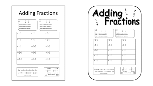
Look at the two worksheets above. They are the same. But which would you be more likely to spend $0.99 on for your students? Both will save you the same amount of time, both cost the same, and both have the same amount of practice problems (they actually have the exact same practice problems).
But I bet you like the one on the right better. Why?
The one on the right has a more inviting font for the title. The tile is also bigger and bolder, making it more appealing. I also added images of fractions around the title and rotated them slightly. Finally, the border is not a box, but it is a box with beveled edges and a contour line (which actually is hard to see – the fact that it’s two lines instead of one).
It took me just a few extra minutes to make these touches, but I think you’ll agree that it makes a big difference.
5 – Digital Paper
When I was first told that I should be using ‘digital paper’ I was so confused. How can paper be digital?
Apparently, digital paper is a new, fancy term for “backgrounds for your TpT resources.”
I do not use digital paper on my products. Again, I did not have a good training when I began my TpT journey and have learned everything through trial and error. So I am again in the process of updating my products.
I am not sure yet that all products need a digital background, but many should have them – especially task cards! They are also very popular on preview images and thumbnails.
For the image above, I went onto TpT and searched the words “Digital Paper.” I ordered the search results in ascending order so that I could see the FREE ones first. I did have to scroll to a few pages before I started finding stuff that I wanted.
When I read the terms of agreement for the first item I downloaded, it did say that I could use them on TpT products that I was selling, however it did not give me permission to use on my blog. So I scrolled a bit farther and found this Colorful Heart Digital Paper by PinkApple Prints – which have no terms of usage.
She has posted this for free so that we could sample her work, in hopes that we will purchase some of her other digital paper (a great strategy that you should also use). By the way, her other digital paper products look REALLY good!
Another “by-the-way,” see all the free publicity she has gotten from posting this resource? This is why you should be posting free content onto your TpT store. You never know who’s going to find it and share it with their friends – or on their blog.
Back to the point. You can see what a difference adding digital paper does to your resources. Most people use it for the backgrounds on their thumbnail and preview images. But if you find something good, you can leave it on your product. I encourage you to play around with it and see if you think it makes the resource pop.
From Start to Finish
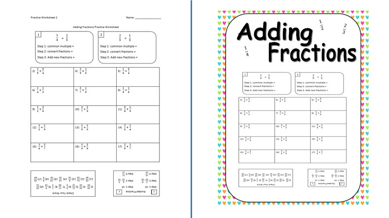
The two images above are of the SAME GREAT RESOURCE!
The one on the left is what I originally created. A very good, practical resource that will help students learn how to add fractions.
The one on the right is the same resource with a border, different font for the title, some images (admittedly, the images are just fractions), and digital wall paper for the background. Of course, this was all done in PPT.
Which would you be more likely to purchase for your students?

Would you like some help getting started?
As I said, I am making several hundred dollars a month on TpT. I don’t need to tell you, teacher, what a big difference that is making for my family. I am so much less stressed, and I can spoil my children just a bit (with things like trips to the movies or ice cream – which I formally could not do).
But it took me a long time, and a lot of work to learn all the tips and strategies to become successful.
I can walk you through the process, step by step, of opening a store, creating great products, and helping people find your resources so that you too can find success and some financial peace.
I have an online course that is just for you. In it, together, we will create your store, create and upload great teaching resources, and drive traffic to them so that you can make your first $1,000 on TpT.

Free eBook
Download the free ebook to get started today
